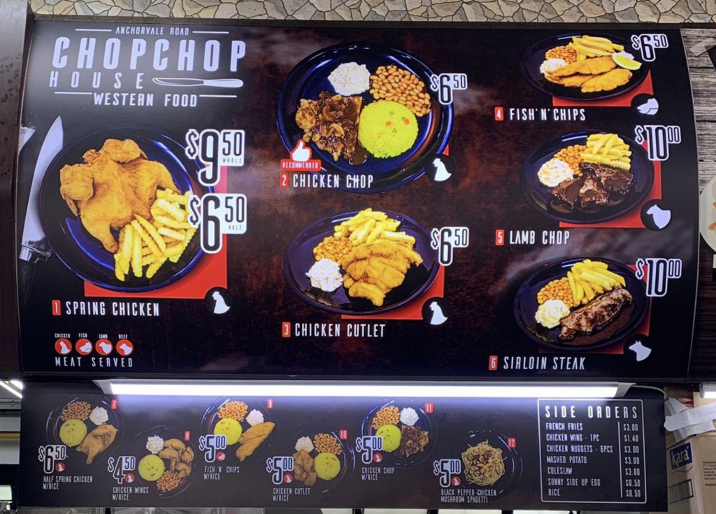
Every F&B business needs to have a good signage that will help them create awareness about their products, but most of the time they don’t know what makes a good sign.
A lot of businesses think that having an appealing design is enough to make their signage stand out from the crowd, but in reality there’s more to it than just looking pretty. Some may resort to cutting corners by going with cheap options because they think they’ll save money and time in the long run. But this is just not true!
It’s not just about what it says, but how it makes you feel. A good business signage can be as simple as a single word or phrase. It can also be an entire sentence with a catchy slogan. The best signs are those that make people stop in their tracks and take notice of your company name for the first time.
Size Matters
You’re looking for a sign, and you want it to be big. That’s great! The bigger the better, right? Well, not always. A large sign can be difficult to manage and expensive to maintain over time. It also might not fit in your budget or on your property. So what should you do?
We will recommend the perfect size sign for your business needs and goals – one that is both affordable and easy-to-manage.

Signage Content
An effective store sign should indicate your business name and logo, a tagline and a list of products and services that you offer.
Your signage is one of the first things people see when they come into contact with your business. It’s important that it reflects who you are as a company! So take some time to think about what message or tone of voice would best suit your brand before designing anything.
We also recommend adding impactful visuals because these days many people rely heavily on visuals when deciding whether they want to make a purchase.
Layout Design
Layout is a key element in signage! Have you ever been to a store and had trouble finding the sign? Well, that’s not going to happen with our help!
If you want people to notice your sign, it’s important that the colours are eye-catching and do not blend in with the background or backdrop color of a building.
Logos should be easy to spot on signs as well. Colours should also contrast from each other so they stand out. The logo placement is crucially important too – these days many companies have logos at their top level pages, but some still place them within text instead of over graphics for example (which has its own merits). It’s all about having an original layout design and then sticking by those rules when making adjustments if possible.
We make sure your signage is always visible, even in low light.
We have been designing quality signage for F&B establishments since 2014, so we know exactly how important it is to put out high-quality products at an affordable price point. We offer a wide range of services from graphic design all the way through installation and maintenance so you won’t have to worry about anything except running your business better than ever before!
Whether it’s a simple storefront sign or something more complex like a logo or building wrap, we’ll work closely with you until everything looks perfect. And if there are any changes along the way, no worries – we offer revisions so that nothing slips through the cracks! It doesn’t matter what type of signage needs you have
Interested in our services?
We offer custom-made signs designed specifically for your business needs at affordable prices without sacrificing quality or design.
Get in touch with us today!
