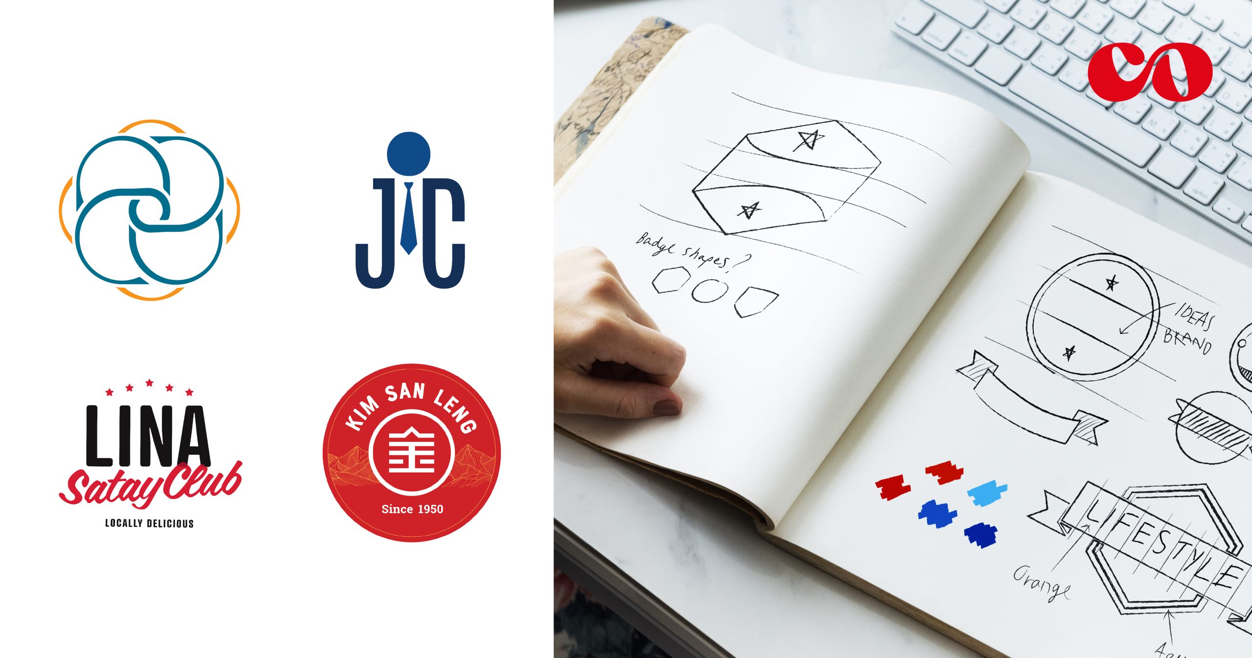
Logos possess a unique language of their own, capable of speaking volumes without uttering a single word. In this article, we’ll embark on a thrilling journey through the world of logo language, exploring the fascinating forms it takes: symbols, wordmarks, monograms, and emblems. So, fasten your seatbelts and get ready to unravel the secrets behind these powerful design elements!
Superheroes of the logo world: Symbols
Symbols, the superheroes of the logo world, possess an awe-inspiring power that transcends the limitations of language. They have the remarkable ability to convey profound meaning, evoke emotions, and ignite instant recognition with just a single image.
One of the greatest strengths of symbols lies in their ability to achieve brand recognition on a global scale. Through careful design and strategic implementation, symbols become synonymous with the brands they represent.
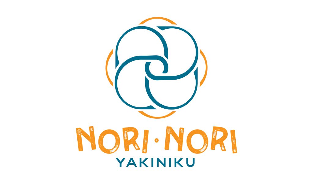
Logo Design for Nori Nori Yakiniku
The logo crafted for Nori Nori Yakiniku draws inspiration from the Kusudama, a Japanese paper ball symbolizing happiness and joy. The logo features a sophisticated geometric symbol based on the Kusudama, with the brand name “NORI” incorporated using varying thickness lines. This design reflects the brand’s commitment to happiness, sophistication, and unwavering dedication to customers.
The Art of Typography: Wordmarks
In the vast landscape of logo design, wordmarks emerge as the eloquent wordsmiths, weaving a compelling narrative through the artful arrangement of typography. Unlike symbols that rely on visual imagery, wordmarks primarily focus on the power of letters, fonts, and the interplay of design elements to convey a brand’s essence.
Wordmarks have a unique advantage—they allow the brand’s name to take center stage. By transforming words into visual expressions, wordmarks ensure that the brand’s identity is front and center, leaving a lasting imprint on our collective consciousness. When we encounter a well-executed wordmark, the brand’s name becomes synonymous with its values, personality, and offerings.
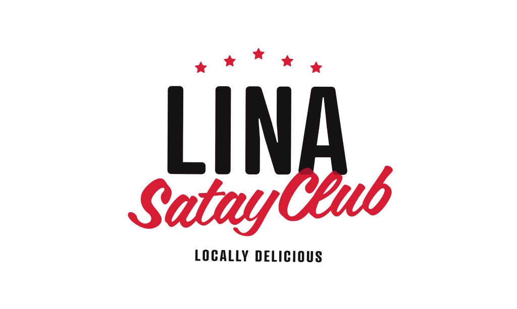
Logo Design for Lina Satay Club
The logo for “Lina Satay Club” is a visually striking and bold representation of its locally delicious offerings. The design features a captivating wordmark in a combination of black and red, exuding a sense of passion and culinary excellence. The design exudes confidence, passion & authenticity.
Merging Letters into Elegant Harmony: Monograms
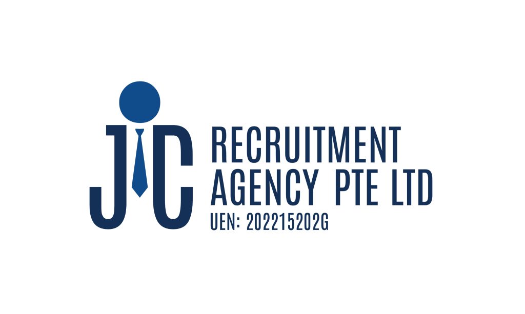
Logo Design for JC Recruitment Agency Pte Ltd
Monograms, the masters of elegance and compactness in logo design, elevate the art of merging letters into a harmonious entity. With their skillful intertwining of initials or abbreviations, monograms create a visual shorthand that exudes sophistication, exclusivity, and a touch of heritage. These designs have the unique ability to evoke a sense of prestige, instantly recognizable and associated with esteemed brands and individuals.
What sets monograms apart is their ability to distill complex names or concepts into elegant and compact designs. By merging letters in creative and artful ways, designers create visual representations that go beyond individual characters. Monograms become a fusion of identities, combining the essence of multiple elements into a single, cohesive mark.
Crafting Timeless Stories: Emblems
Emblems are indeed the storytellers of intricate narratives, weaving together various elements to create designs that go beyond mere visual representation. Their ability to blend symbols, typography, and intricate details sets them apart, allowing them to convey rich stories and evoke emotions.
One notable application of emblems is in establishing a prestigious personality for a brand. Companies and organizations often turn to emblems to create a visual identity that exudes a sense of grandeur, tradition, and excellence. By incorporating intricate details, regal symbols, and carefully crafted typography, emblems can elevate a brand’s image, positioning it as a distinguished and reputable entity.
They also possess a timeless quality that transcends fleeting design trends. They reflect enduring values and traditions, allowing them to withstand the test of time. While design styles may evolve, emblems maintain their significance and evoke a connection to history. They carry a sense of permanence, which resonates with both current and future generations. Emblems can become cherished symbols, passed down through generations, and preserving the brand’s legacy.
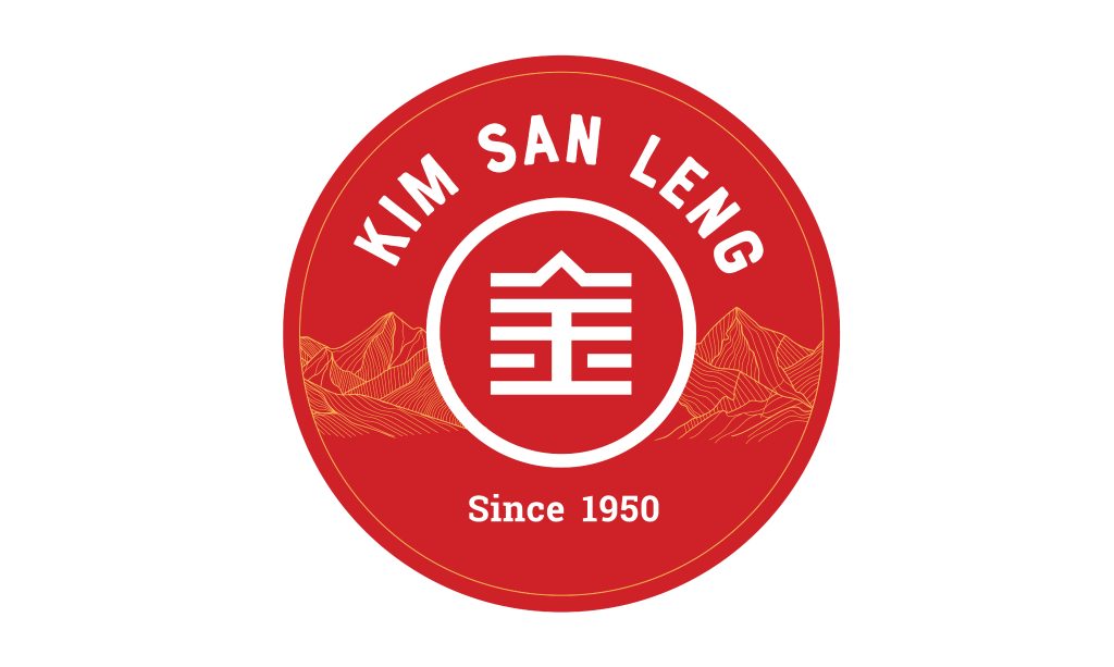
Logo Design for Kim San Leng
The logo for Kim San Leng, a renowned coffee shop chain, is carefully designed to reflect the brand’s identity and values. The logo features an emblem incorporating elements inspired by mountains, and a color palette consisting of gold and red.
The mountains symbolize stability, strength, and a sense of rootedness. It represents the brand’s commitment to preserving its heritage and providing a dependable and comforting experience for patrons.
Interested in our services?
Need a logo that speaks volumes about your brand?
Get in touch with us today.
🖥️ http://co-enterprise.com.sg/
💌 marketing@co-enterprise.com.sg
📞 +65 6976 8060
