You’ve got a great idea for an F&B business. You’ve found the perfect location, you have all the equipment and food you need, and you’re ready to start making your mark on the world of foodie culture.
But before you can even think about opening your doors, you need to design a logo that represents everything your brand stands for. Your logo is going to be your business’s first impression on customers, so it needs to be memorable and instantly recognizable—and it should also reflect what makes your brand special.
When it comes to designing the perfect logo for your F&B business, there are a few things to keep in mind. The logo plays a vital role in the success of your F&B business.
The logo should convey everything about your business in an instant
It should be easy on the eyes and it should make people want to come back again and again. A good logo represents your brand’s identity, which means it needs to be simple yet memorable enough so that customers can easily recognize it at first glance.
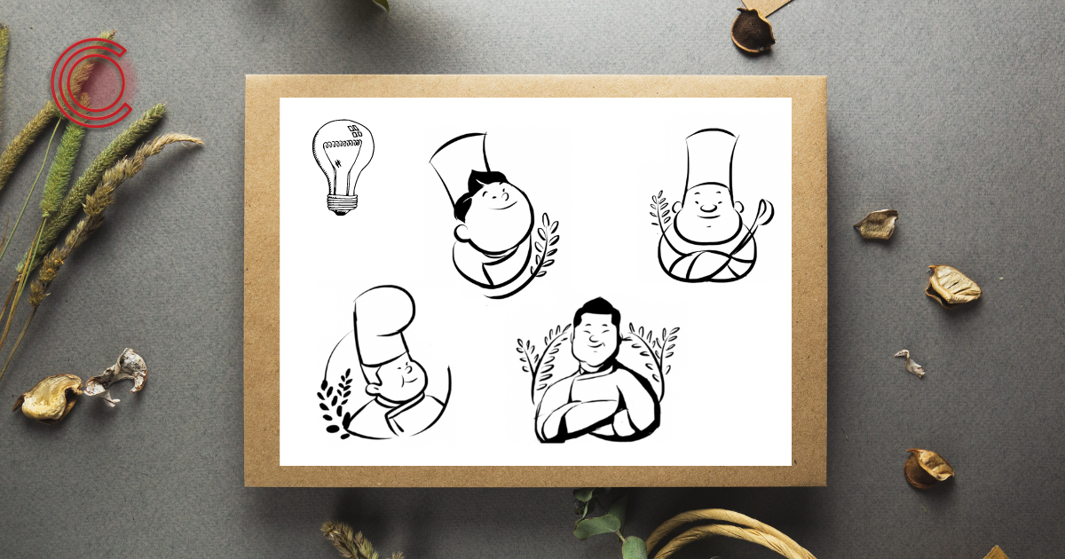
There are many different types of logos, but there are two main types
Wordmarks and logos with graphics. The type of logo you choose depends on what kind of brand you want to create and what message you want to send out.
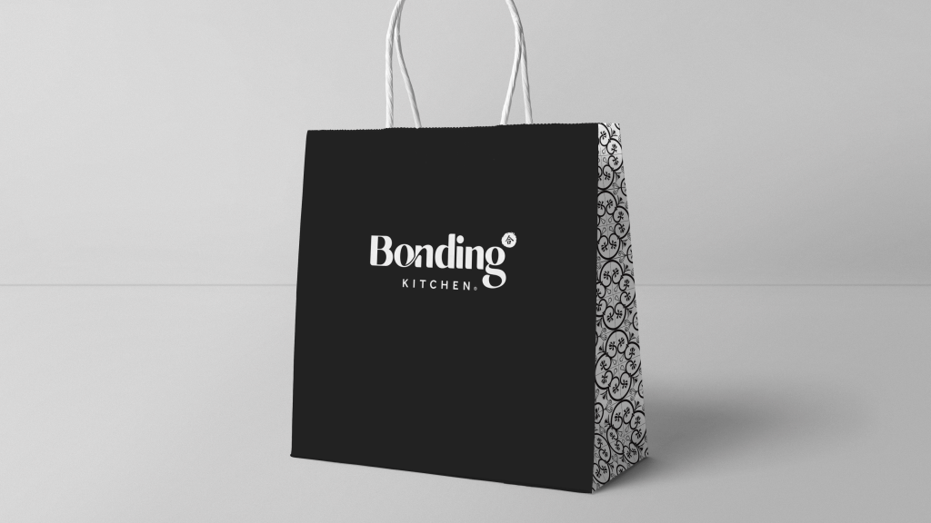
Wordmarks are made up of words or letters that form a unique shape or design. They often contain a slogan or mission statement, which helps customers identify the company they’re working with. This can be especially effective if your product has an unusual name or spelling, as it makes it easier for customers to recall who they bought from the last time around.
Logos with graphics are much more common these days, as they provide greater visual impact than wordmarks do by themselves; however, they can sometimes be harder to remember as well because there’s no clear meaning behind them (which is why we recommend adding a slogan).
Keep it simple
You don’t need an entire story in your logo design—just enough that people get the idea right away.
Keep it consistent
Customers expect consistency across all channels, so make sure your logo looks good everywhere (website, social media profiles, print ads, etc).
Make sure it works in black and white
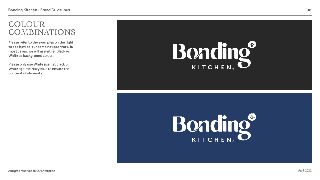
If your logo only looks good in one colour scheme, it’s not going to work as well when printed on different materials like t-shirts or paper products like napkins or cups. It’s also not going to translate well into other mediums like signage or websites if there isn’t enough contrast between different elements within the design itself (which would result in some parts being illegible).
Finally, test out some different options before settling on one that works best.
A good logo can help distinguish your business from competitors, express what sets you apart from other businesses in your industry, and even make it easier for customers to remember exactly who they’re dealing with when they walk into your establishment or use your product. A bad logo may not only fail to accomplish any of those things—it can actually hurt how people view your brand.
Logos are a lot like people. They have personalities, and those personalities can change over time. Your logo is the face of your business, so you want it to be something that reflects who you are and what you offer. It should reflect the personality of your business without being too on-the-nose about it—and it should look good on every surface from social media to the menu and napkins at your store.
Interested in our services?
If you’re looking to get started in the food and beverage business, you might be wondering how to design the perfect logo for your brand. We’ve got you covered.
Get in touch with us today.
🖥 http://co-enterprise.com.sg/
💌 marketing@co-enterprise.com.sg
📞 +65 6976 8060