Your food products will soon find themselves on the shelf of whatever store you have chosen to partner with – and they will be sharing their attention alongside many other competitors looking to sell their similar items too. We can help you be much more prominent with these simple design tips that you can incorporate into your designs!
Target Audience

Before you put visuals onto your packaging – consider your target audience first. While you might think an aesthetically pleasing design might pull in everyone – but if it draws in the wrong crowd who are confused about what you offer, it is counter-productive in the process.
Imagery
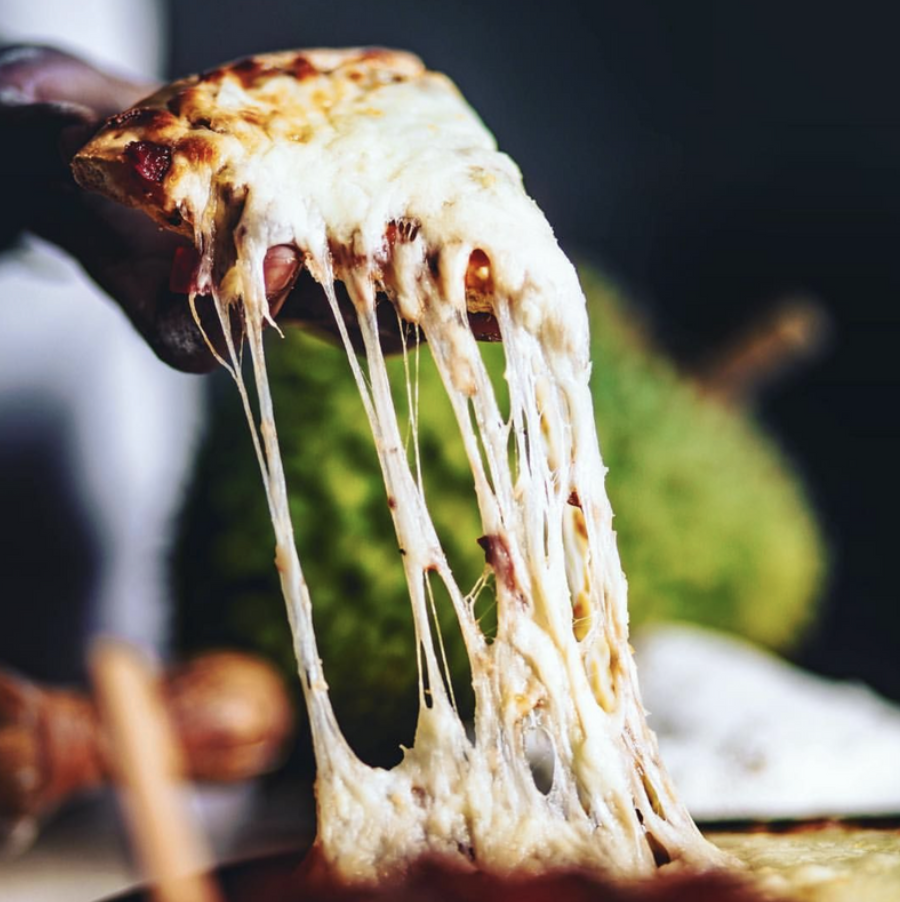
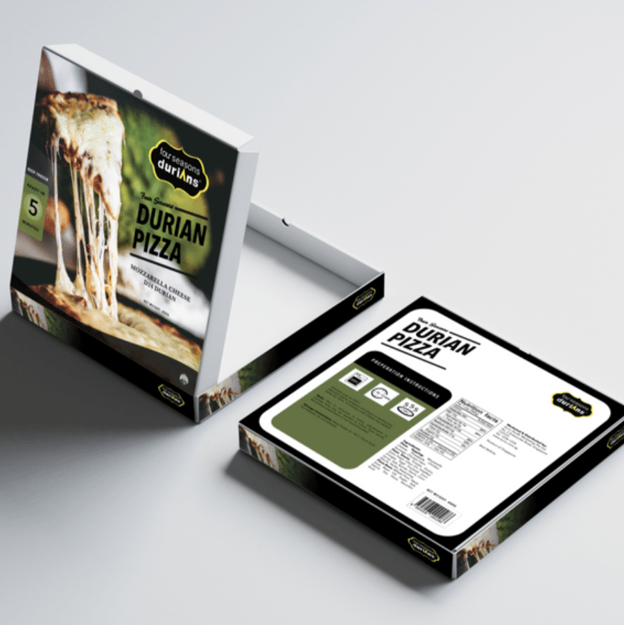
Great copy will draw in anyone, but an equally strong image could have the same effect if used correctly. Perhaps an appealing glam shot of your food on your box might get others to pick yours more often, as well as make you stand out on the shelf visually.
Making It Memorable
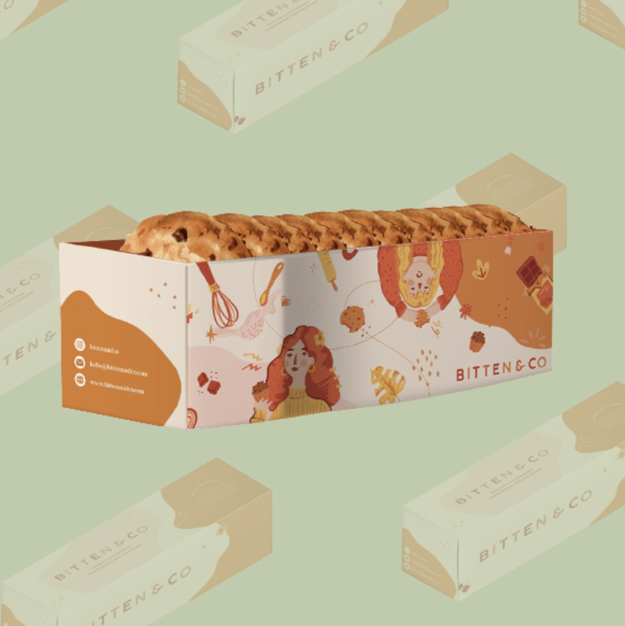
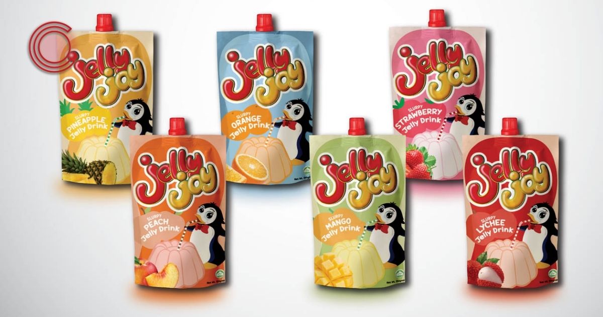
Logos are designed to be as memorable as possible – so the same applies to packaging. Make it easy to remember – so when others look at it on the shelf, they immediately think of your brand and food items.
Texture
You want the experience of holding your product to be unique since touch is an important sense. Make customers realise how great your packaging feels in their hands.
Shape
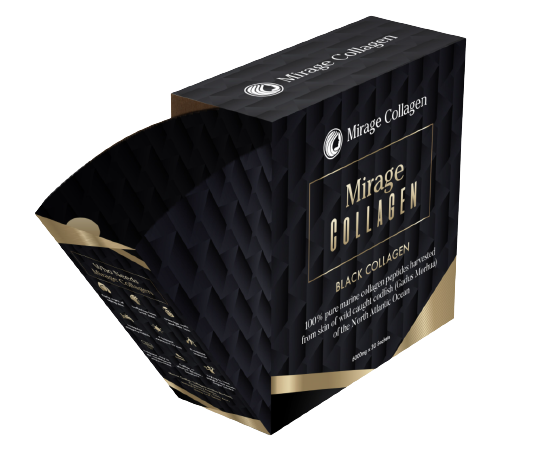
Squares and rectangles are common shapes for holding items within a package, but have you considered shapes that are a bit more out of the norm? Triangles, circles, and certain other geometric shapes are uncommon, but they definitely would turn the attention and eye of people should you execute it well.
Interested in our services?
Let us design something that will turn both eyes and get them into purchase carts – with our expertise, we are sure that we can do that for you.
Get in touch with us today!
🖥 http://co-enterprise.com.sg/
💌 marketing@co-enterprise.com.sg
📞 +65 6976 8060

