I’m sure you’ve heard the term “brand guide,” but what does it mean?
It’s like an NRIC, but for your brand. A brand guide is a document that outlines your company’s identity and how to use it. It helps people understand who you are, what you do, and why they should care about your business. It also includes guidelines for using logos, colors, fonts, etc., which can be helpful when designing marketing materials or other collateral.
Once you have a brand guide in place, all of your brandings will be consistent across all channels—from social media to print ads to website design. This consistency builds trust with customers because they know exactly who they’re dealing with at all times.
We will be sharing how we executed a brand guide from scratch for Tackle Box.
Goals, Ideals & Objectives
You want to ensure that designers know what they are doing when they make your ads, as well as copywriters knowing how to veer their tone of voice towards your customers. Having goals and objectives stated in your guide will help you immensely with that – as they will understand what you are trying to do for others and thus can adjust designs accordingly.
Brand Voice
While this might be similar to goals and objectives, the brand voice part is to ensure that any designs that are made adhere to the personality of your brand. You would not want to create a super-premium luxury ad for a fun-loving candy company, would you? Thus, it is important that this is stated clearly too.
Primary and Secondary Logo
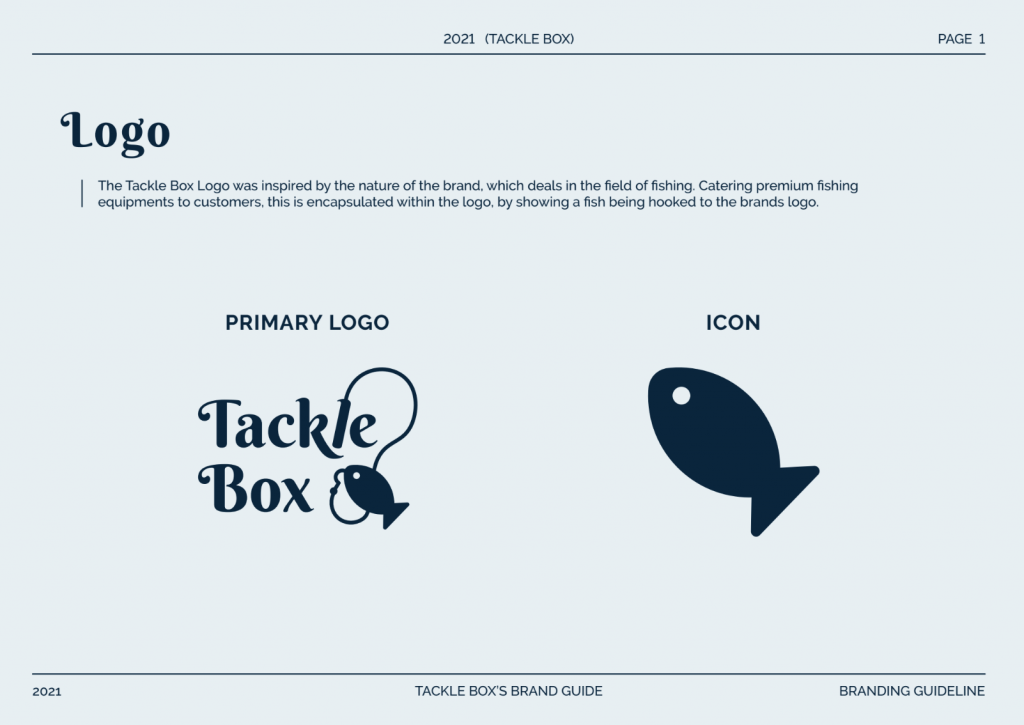
Application of your logos in various situations should also be laid out on your guide too – as we do not want it to look bad or desecrated should there come to a scenario where it has to be used in an unconventional way.
Logo Usage
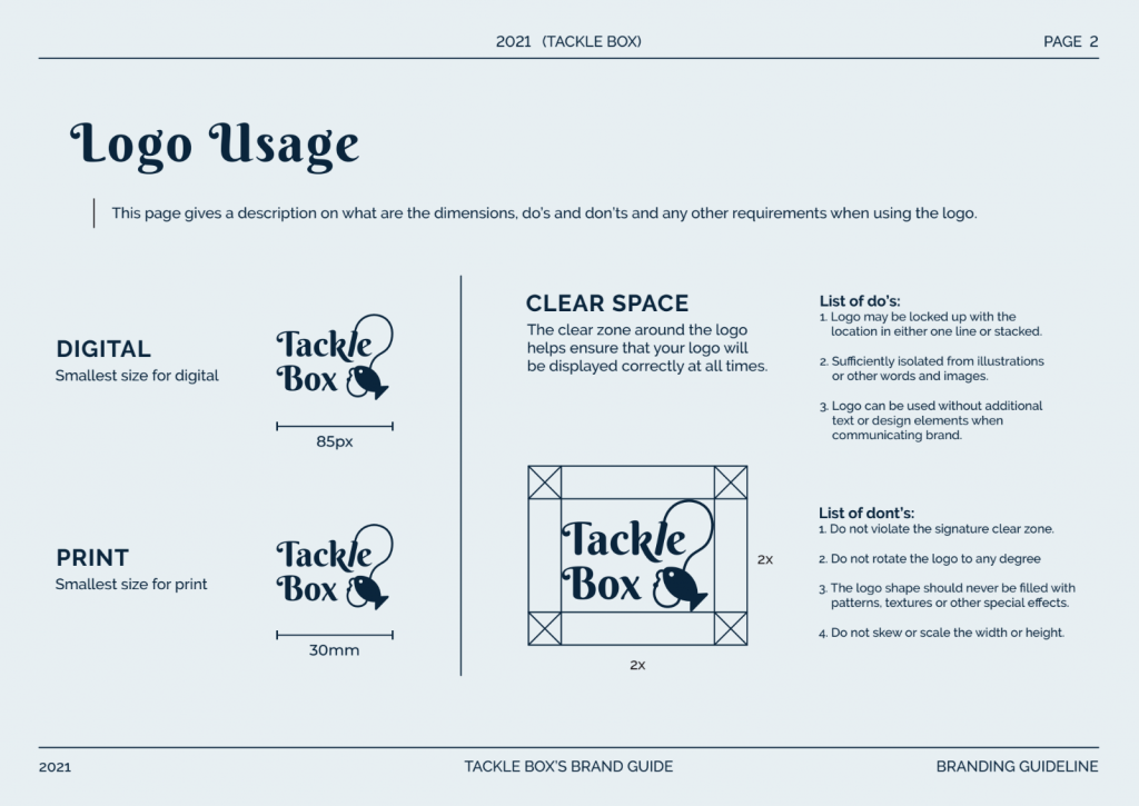
A logo is the visual representation of your company. It’s what people see and remember about you. It is important to highlight the do’s and don’ts when using the logo especially for print.
Colours
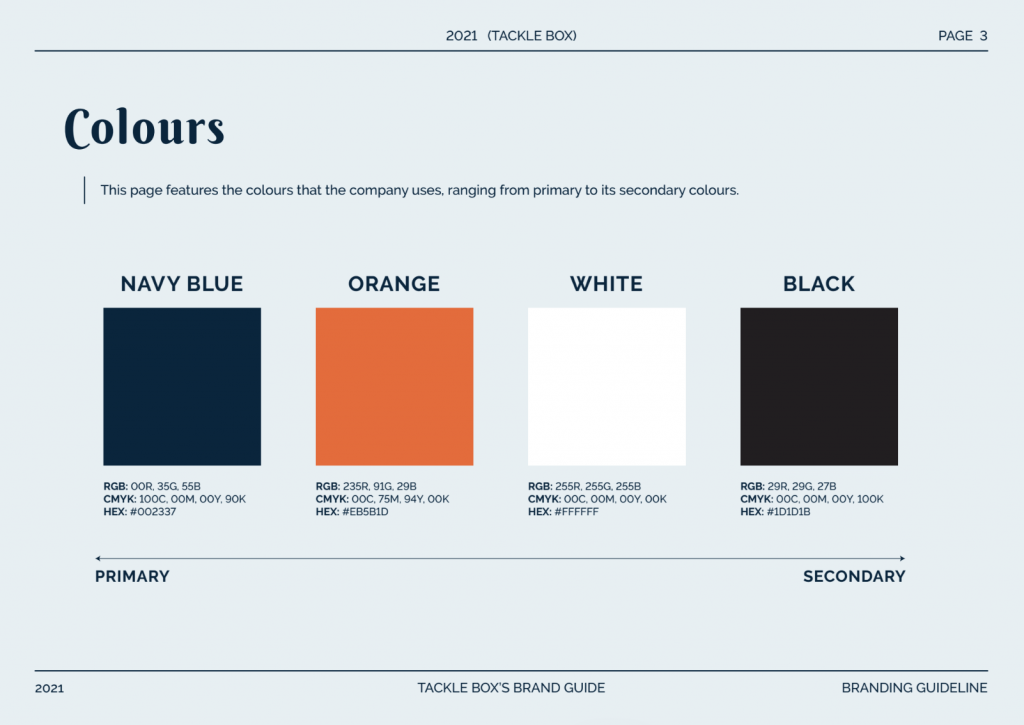
It is obvious that colours are very important for a brand, and they are also a key factor in maintaining consistency throughout your entire brand as a whole. A constant focus on specific colours will help audiences associate your brand with them – and automatically let them understand what you are.
Colour Combinations
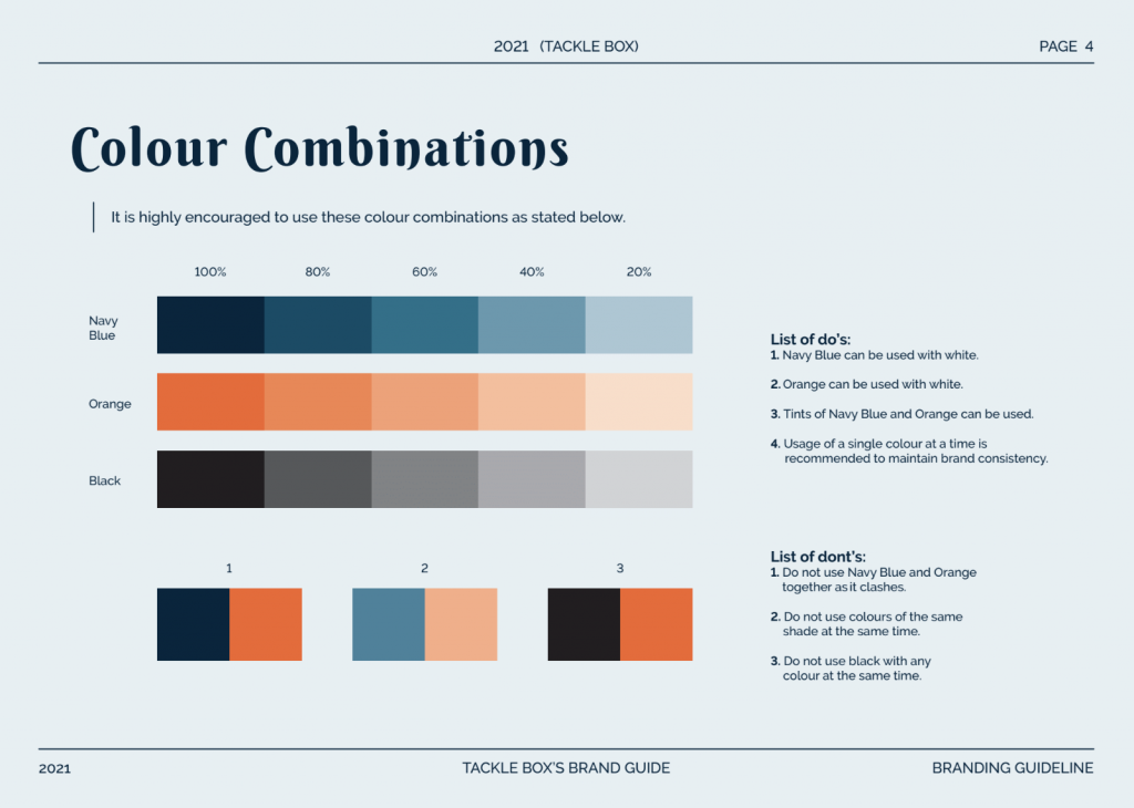
Include the colours that works best together and how they can make your brand pop. Create a cohesive colour palette that’s perfect for any design collaterals.
Typography & Type Layout
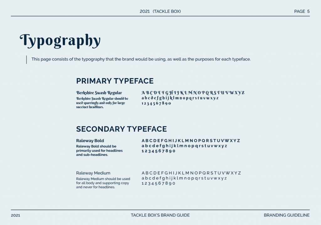
Fonts help to ensure that your visual elements are always cohesive, as it can help dictate how you ‘talk’ to others within your advertising.
Photography and Imagery Guidelines
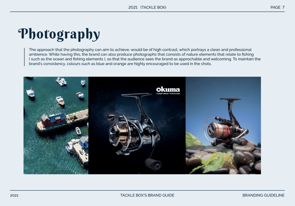
How photos should be applied on your websites as well as social media pages should be of paramount importance. Composition, style, and concepts should be kept in mind in this guideline.
Creative Artworks
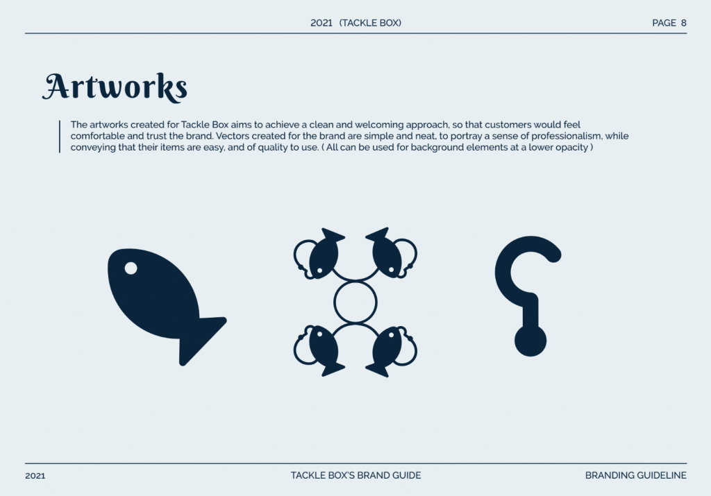
At the end of your guide, you might want to state if you allow for experimentation with the brand guide or not. This might be useful for letting creators tinker around while remaining true to your brand’s image.
Logo Misuse
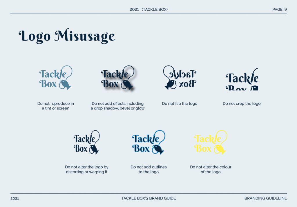
Logo misuse covers all the big nonos for using your logo.
Interested in our services?
We can create beautiful brand guides that will be both full of information as well as being visually appealing.
Get in touch with us today!
